Selecting the appropriate font for your channel letter sign is a critical aspect of crafting an impactful visual identity for your business. This article aims to provide guidance and examples to assist you in making informed font choices that align with your brand image and effectively communicate your message.
Factors to Consider in Font Choosing for Channel Letters:
When choosing a font for your channel letters, several factors should be taken into account to ensure optimal visibility, readability, and brand consistency:
- Readability: Readability ensures that the font is easily discernible, even from a distance. Choosing a font with adequate contrast between the letters and the background, as well as appropriate spacing between characters, enhances readability, making the sign more effective in conveying its message to viewers.
- Legibility: Legibility refers to the clarity and simplicity of the font, allowing the entire message to be displayed without any letters being truncated or obscured. A font with clear and distinct letterforms ensures that the message can be easily understood by viewers, contributing to the effectiveness of the signage.
- Visibility: Visibility considers the environmental conditions where the sign will be placed to ensure that it remains highly visible to passersby. Factors such as lighting, obstructions, and viewing distance influence visibility, and selecting a font that maintains its clarity and legibility under various conditions maximizes the sign’s visibility and impact.
- Branding Consistency: Branding consistency involves selecting a font that aligns with your brand identity and is compatible with your logo. Consistency in font choice across different marketing materials reinforces brand recognition and helps maintain a cohesive brand image, enhancing brand recall and perception among customers.
- Style Compatibility: Style compatibility ensures that the font accurately conveys the intended message and reflects the desired image of your business. Whether it’s modern, traditional, playful, or sophisticated, choosing a font style that complements your brand’s personality and resonates with your target audience enhances the effectiveness of the signage in communicating your message.
- Adaptability to Surroundings: Adaptability to surroundings considers how the font will appear in different lighting conditions and environments. Whether the sign is placed indoors or outdoors, in bright sunlight or dimly lit areas, selecting a font that remains clear and legible ensures that the message can be effectively communicated regardless of the surroundings, maximizing the sign’s impact.
- Scalability: Scalability refers to the font’s ability to maintain its clarity and legibility when scaled to different sizes. Whether the sign is large or small, ensuring that the font retains its readability and visual appeal when resized enhances the sign’s versatility and effectiveness in various applications, from storefronts to billboards.
Fonts That Work Well for Channel Letter Signs:
Various fonts are well-suited for channel letter signs, each offering unique characteristics and stylistic elements:
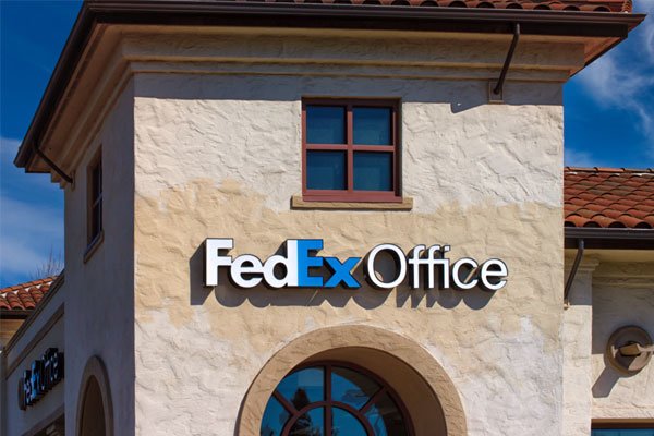
- Helvetica: Helvetica is a versatile sans-serif font known for its clean and modern appearance. It’s highly legible and works well for both small and large-scale signage due to its simplicity and neutral design.
- Futura: Futura is a geometric sans-serif font characterized by its sleek and futuristic look. It’s ideal for channel letter signs seeking a contemporary and stylish aesthetic, and its geometric shapes ensure readability from a distance.
- Garamond: Garamond is a classic serif font with elegant and timeless characteristics. It’s suitable for channel letter signs aiming for a sophisticated and traditional vibe, and its graceful letterforms add a touch of refinement to signage.
- Trajan Bold: Trajan Bold is a serif font inspired by Roman inscriptions, featuring bold and authoritative letterforms. It’s perfect for channel letter signs requiring a sense of gravitas and authority, making it a popular choice for institutional and corporate signage.
- Myriad: Myriad is a versatile sans-serif font designed for clarity and legibility. Its clean and modern appearance makes it suitable for a wide range of channel letter signs, and its flexibility allows for easy customization to match brand identities.
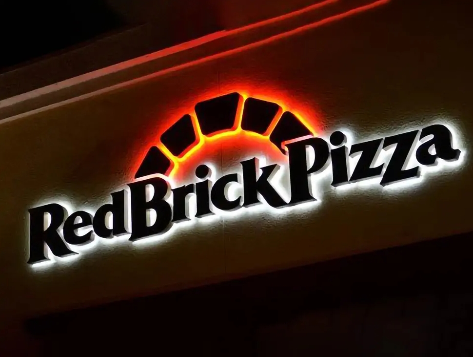
- Rockwell: Rockwell is a bold and robust slab-serif font with a distinctive and impactful presence. It’s ideal for channel letter signs seeking a bold and attention-grabbing design, and its strong letterforms ensure visibility even from a distance.
- Verdana: Verdana is a sans-serif font optimized for digital displays, known for its clarity and readability. It’s suitable for channel letter signs requiring high legibility, especially in outdoor or illuminated settings where visibility is crucial.
- Times New Roman: Times New Roman is a classic serif font renowned for its readability and authority. It’s an excellent choice for channel letter signs aiming for a traditional and professional appearance, and its timeless design ensures clear communication of messages.
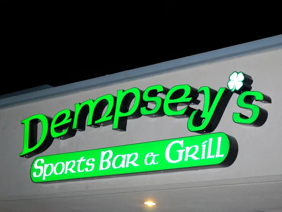
- Script: Script fonts are characterized by their elegant and flowing letterforms, resembling handwritten script. They’re suitable for channel letter signs seeking a decorative or personalized touch, adding sophistication and charm to signage.
- Clarendon: Clarendon is a bold serif font with distinctive slab-serif letterforms. It’s suitable for channel letter signs requiring a strong and impactful design, and its bold strokes ensure visibility and legibility in various environments.
- Arial: Arial is a versatile sans-serif font known for its simplicity and clarity. It’s suitable for channel letter signs requiring a clean and modern appearance, and its uniform letterforms ensure readability from a distance.
- Century Gothic: Century Gothic is a modern sans-serif font characterized by its geometric letterforms. It’s suitable for channel letter signs seeking a contemporary and stylish look, and its clean design ensures clear communication of messages.
Tips for Selecting the Right Font for Channel Letter Signs:
To make informed font choices for your channel letter signs, consider the following tips:
- Understand Your Brand Identity: Align the font selection with your brand personality and values.
- Assess Location and Environmental Factors: Consider the sign’s placement and surroundings to ensure optimal visibility.
- Prioritize Simplicity in Design: Choose a font that is clean, simple, and easy to read.
- Seek Professional Guidance: Consult with a graphic designer or sign company for expert advice on font selection.
- Experiment with Font Sizes and Styles: Test different font sizes and styles to find the most suitable option for your signage.
- Consider Illumination Compatibility: If the sign will be illuminated, choose a font that complements the lighting source and enhances visibility.
Conclusion:
Choosing the right font for your channel letter sign is a crucial step in creating a visually appealing and effective signage solution for your business. By considering factors such as readability, brand consistency, and environmental suitability, and exploring a range of font options, you can ensure that your channel letter sign effectively communicates your message and enhances your brand image.


Yorum Bırak